Css学习: 一种组合实现的优惠券打孔效果
纯 CSS 实现优惠券透明圆形镂空打孔效果
🕐
先看效果
- 先看组合
- 再看真实效果

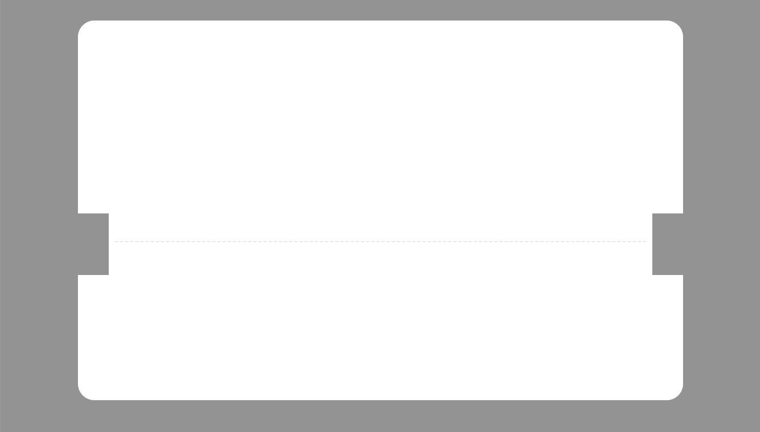
核心代码
.coupon-middle div {
  /* 中间虚线 */
  position: absolute;
  left: 36px;
  right: 36px;
  top: 29px;
  border-top: 1px dashed #e6e6e6;
  z-index: 9;
}
.coupon-middle:before,
.coupon-middle:after {
  content: '';
  border: 300px solid #ffffff;
  position: absolute;
  width: 60px;
  height: 60px;
  /* border-radius: 50%; */
  top: 50%;
  margin-top: -330px;
}
.coupon-middle:before {
  left: -330px;
}
.coupon-middle:after {
  right: -330px;
}
完整代码
<!DOCTYPE html>
<html lang="en">
  <head>
    <meta charset="UTF-8" />
    <meta name="viewport" content="width=device-width, initial-scale=1.0" />
    <title>Toolitp meet drop-shadow</title>
    <style>
      body {
        background: #939393;
      }
      .coupon {
        width: 590px;
        height: 370px;
        border-radius: 16px;
        overflow: hidden;
        display: flex;
        margin: 20px auto;
        flex-direction: column;
      }
      .coupon-top,
      .coupon-bottom {
        background: #ffffff;
      }
      .coupon-top {
        flex: 1;
      }
      .coupon-bottom {
        height: 120px;
        padding: 0 38px;
      }
      .coupon-middle {
        height: 64px;
        position: relative;
        overflow: hidden;
      }
      .coupon-middle div {
        /* 中间虚线 */
        position: absolute;
        left: 36px;
        right: 36px;
        top: 29px;
        border-top: 1px dashed #e6e6e6;
        z-index: 9;
      }
      .coupon-middle:before,
      .coupon-middle:after {
        content: '';
        border: 300px solid #ffffff;
        position: absolute;
        width: 60px;
        height: 60px;
        border-radius: 50%;
        top: 50%;
        margin-top: -330px;
      }
      .coupon-middle:before {
        left: -330px;
      }
      .coupon-middle:after {
        right: -330px;
      }
    </style>
  </head>
  <body>
    <div class="coupon">
      <div class="coupon-top"></div>
      <div class="coupon-middle">
        <div></div>
      </div>
      <div class="coupon-bottom"></div>
    </div>
  </body>
</html>
更巧的实现
利用 radial-gradient 实现,但感觉理解起来比较费劲 https://www.jb51.net/css/765708.html
background: radial-gradient(circle at right top, transparent 10px, #00adb5 0) no-repeat;
circle:这部分指定渐变的形状为圆形,即从中心向外辐射的渐变。
at left top:表示渐变的中心点位于元素的左上角。
transparent 20px:从渐变的中心开始,半径为20像素的区域内是透明的。这意味着距离渐变中心20像素以内的区域是完全透明的。
white 0:从半径为20像素的区域之后开始,渐变到纯白色(white)的颜色。颜色的起始位置为0,即从透明到白色渐变。
.hollow-compose-three-circles {
  width: 300px;
  height: 100px;
  position: relative;
  background: radial-gradient(circle at right top, transparent 10px, white 0);
  /* filter: drop-shadow(2px 2px 2px rgba(0, 0, 0, 0.2)); */
}